Difference between revisions of "DeviceOrientationMoveOnChange"
(→Editor Interface: Adding image) |
(→Editor Interface: Updated for new interface) |
||
| (One intermediate revision by one user not shown) | |||
| Line 14: | Line 14: | ||
== Editor Interface == | == Editor Interface == | ||
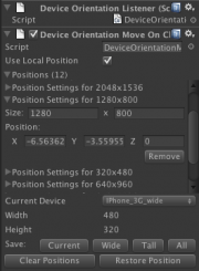
[[File:DeviceOrientationMoveOnChanged.png|thumb|right|The custom editor interface for this script]] | [[File:DeviceOrientationMoveOnChanged.png|thumb|right|The custom editor interface for this script]] | ||
| − | This class comes with a custom editor interface that allows the designer to easily save and restore the position of the object for various screen sizes. Many common device screen sizes are provided in a drop-down menu. | + | This class comes with a custom editor interface that allows the designer to easily save and restore the position of the object for various screen sizes. Many common device screen sizes are provided in a drop-down menu. |
| + | === Saving === | ||
| + | Next to the label "Save" there are some buttons. Clicking any one of them will overwrite existing positions for screen sizes that already exist in the list, or create a new entry in the list if that screen size wasn't found. | ||
| − | + | '''Current''': This will save the object's current position for the device selected in the drop-down box. Custom screen sizes can also be saved by selecting "Custom" from the drop-down menu. Using this button will save the current position for a screen size with the Width and Height shown. (This button is only available if the width and height are not 0). | |
| − | + | '''Wide''': This will save the current position for landscape mode of all supported devices. | |
| + | |||
| + | '''Tall''': This will save the current position for portrait mode of all supported devices. | ||
| + | |||
| + | '''All''': This will save the current position for all supported devices. | ||
| + | |||
| + | === Modifying the List === | ||
| + | |||
| + | You can clear the list of all positions by clicking "Clear Positions". | ||
| + | |||
| + | === Restoring === | ||
To restore the position for a specific device, select the device from the drop-down menu and click "Restore Position". | To restore the position for a specific device, select the device from the drop-down menu and click "Restore Position". | ||
| + | |||
| + | === Supported Devices === | ||
| + | *iPhone 3G/iPod touch (480x320) | ||
| + | *iPhone 4 (960x640) | ||
| + | *iPhone 5 (1136x640) | ||
| + | *iPad/iPad 2 (1024x768) | ||
| + | *iPad 3 (2048x1536) | ||
| + | *Nexus 7 (1280x800) | ||
[[Category:API]] | [[Category:API]] | ||
[[Category:Mobile]] | [[Category:Mobile]] | ||
[[Category:Premium Scripts]] | [[Category:Premium Scripts]] | ||
Latest revision as of 17:46, 21 April 2013
This script will reposition the object it's attached to when the size of the screen changes.
Contents |
[edit] Public Variables
[edit] positions : List<PositionSettings>
This class maintains a list of settings that will be used to reposition the object when the screen size changes. These settings are stored in a class with the following definition:
  public class PositionSettings {
     public int width = 0;
     public int height = 0;
     public Vector3 position = Vector3.zero;
  };
[edit] useLocalPosition : bool
This tells the class whether or not to use the local position or the world position. This shouldn't be changed once positions are saved.
[edit] Editor Interface
This class comes with a custom editor interface that allows the designer to easily save and restore the position of the object for various screen sizes. Many common device screen sizes are provided in a drop-down menu.
[edit] Saving
Next to the label "Save" there are some buttons. Clicking any one of them will overwrite existing positions for screen sizes that already exist in the list, or create a new entry in the list if that screen size wasn't found.
Current: This will save the object's current position for the device selected in the drop-down box. Custom screen sizes can also be saved by selecting "Custom" from the drop-down menu. Using this button will save the current position for a screen size with the Width and Height shown. (This button is only available if the width and height are not 0).
Wide: This will save the current position for landscape mode of all supported devices.
Tall: This will save the current position for portrait mode of all supported devices.
All: This will save the current position for all supported devices.
[edit] Modifying the List
You can clear the list of all positions by clicking "Clear Positions".
[edit] Restoring
To restore the position for a specific device, select the device from the drop-down menu and click "Restore Position".
[edit] Supported Devices
- iPhone 3G/iPod touch (480x320)
- iPhone 4 (960x640)
- iPhone 5 (1136x640)
- iPad/iPad 2 (1024x768)
- iPad 3 (2048x1536)
- Nexus 7 (1280x800)
