Difference between revisions of "DeviceOrientationMoveOnChange"
(Updating API info) |
(→Editor Interface: Adding image) |
||
| Line 13: | Line 13: | ||
== Editor Interface == | == Editor Interface == | ||
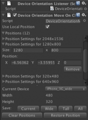
| + | [[File:DeviceOrientationMoveOnChanged.png|thumb|right|The custom editor interface for this script]] | ||
This class comes with a custom editor interface that allows the designer to easily save and restore the position of the object for various screen sizes. Many common device screen sizes are provided in a drop-down menu. The buttons will allow you to save the position for the currently selected device and for all supported devices, as well as restore the position for the currently selected device. | This class comes with a custom editor interface that allows the designer to easily save and restore the position of the object for various screen sizes. Many common device screen sizes are provided in a drop-down menu. The buttons will allow you to save the position for the currently selected device and for all supported devices, as well as restore the position for the currently selected device. | ||
Revision as of 03:50, 18 April 2013
This script will reposition the object it's attached to when the size of the screen changes.
Contents |
Public Variables
positions : List<PositionSettings>
This class maintains a list of settings that will be used to reposition the object when the screen size changes. These settings are stored in a class with the following definition:
  public class PositionSettings {
     public int width = 0;
     public int height = 0;
     public Vector3 position = Vector3.zero;
  };
useLocalPosition : bool
This tells the class whether or not to use the local position or the world position. This shouldn't be changed once positions are saved.
Editor Interface
This class comes with a custom editor interface that allows the designer to easily save and restore the position of the object for various screen sizes. Many common device screen sizes are provided in a drop-down menu. The buttons will allow you to save the position for the currently selected device and for all supported devices, as well as restore the position for the currently selected device.
To save a position for a specific device, select the device from the drop down and then click "Save Current Position". Custom screen sizes can also be saved by selecting Custom from the drop-down menu.
To save the current position for all supported devices, click on "Save All Positions".
To restore the position for a specific device, select the device from the drop-down menu and click "Restore Position".
