DeviceOrientationMoveOnChange
This script will reposition the object it's attached to when the size of the screen changes.
Contents |
Public Variables
positions : List<PositionSettings>
This class maintains a list of settings that will be used to reposition the object when the screen size changes. These settings are stored in a class with the following definition:
  public class PositionSettings {
     public int width = 0;
     public int height = 0;
     public Vector3 position = Vector3.zero;
  };
useLocalPosition : bool
This tells the class whether or not to use the local position or the world position. This shouldn't be changed once positions are saved.
Editor Interface
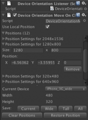
This class comes with a custom editor interface that allows the designer to easily save and restore the position of the object for various screen sizes. Many common device screen sizes are provided in a drop-down menu.
Saving
Next to the label "Save" there are some buttons. Clicking any one of them will overwrite existing positions for screen sizes that already exist in the list, or create a new entry in the list if that screen size wasn't found.
Current: This will save the object's current position for the device selected in the drop-down box. Custom screen sizes can also be saved by selecting "Custom" from the drop-down menu. Using this button will save the current position for a screen size with the Width and Height shown. (This button is only available if the width and height are not 0).
Wide: This will save the current position for landscape mode of all supported devices.
Tall: This will save the current position for portrait mode of all supported devices.
All: This will save the current position for all supported devices.
Modifying the List
You can clear the list of all positions by clicking "Clear Positions".
Restoring
To restore the position for a specific device, select the device from the drop-down menu and click "Restore Position".
Supported Devices
- iPhone 3G/iPod touch (480x320)
- iPhone 4 (960x640)
- iPhone 5 (1136x640)
- iPad/iPad 2 (1024x768)
- iPad 3 (2048x1536)
- Nexus 7 (1280x800)
